Somos+, 26 June 2015 — Somos+ [“We Are More”] is renewing itself. As a sort of reflection of the profound structural and organic transformation that we are undergoing as a result of the increase in our membership, a new visual identity now distinguishes us, brings us closer to our own people — whose borders transcend the Cuban realm and reaches into exile, the diaspora — dispersed, but united in the same feeling.
Digital platforms have been witnesses to the change. A new Web page, a permanent presence throughout our accounts and/or groups in Facebook, Twitter and Instagram, have served to expand the movement’s message, now with new colors and typeface in its identity.
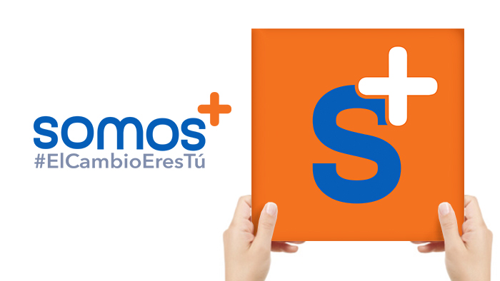
The new graphic, produced by our designers and approved by the movement’s council, was accepted with satisfaction by our Somos+ followers. For nothing so characterizes our projects as that constant spirit of change, renewal and creativity — premises of the future that we desire to construct.
Changes in and of themselves provoke doubts, worries, questions: Why do something different if things have been going well for us just as they are? Won’t our message become diffuse if we introduce new elements, somewhat different from the original ones? Will the changes produce the desired results?
But, what have we we done? Our members have summarized it thus: A perfect simbiosis between the colors and the symbols that represent, without doubt, effective signifiers of our message.
Regarding the colors, there is now a high contrast between the orange, which links to the beginnings of the movement and which also evokes enthusiasm, optimism, vitality, brotherhood, unity — and the blue, which evokes tranquility, serenity, reflection.
On the other hand, the white, located in the position used in mathematics to indicate raising a base number to a power, expresses very well our character: every day more connected to peace, development and the purity of ideas.
The symbols are the other agents of change. Their location inside a square connotes well-defined solidity and stability. The “S” that appears in the middle is one of the most dynamic textual symbols of our language, as much for its sinuous shape as for being the indicator of the plural form in Spanish.
Meanwhile, the + sign — which mathematically indicates aggregating, adding — becomes an indicator of the spirit of the movement, always positive, multiplicative, flexible, as is our horizon: as José Martí said, “For all and for the good of all.”
Another way to view it is to also see in the logo the colors of our flag, but instead of the red of spilled blood, it is orange, which represents the young, active mind, the non-violent form of struggle in which current causes are defended.
The hashtag, “#ElCambioEresTu” [“#The Change is You”], as the new slogan of the movement, is centered on the individual responsibility of every Cuban to contribute to a better country, always to positive and inclusive change. Everyone of us has immense power.
After two years, Somos+ is committed to difference, to marking a milestone, to being a reference point. We launch into the world a new image, as a show of the strengthening of our concepts and our consolidation in the Cuban political scene, with a view to the future. It is, simply, perfecting our strategies, following the same path as always. Only in this way will we continue to be more.
Translated by: Alicia Barraqué Ellison
